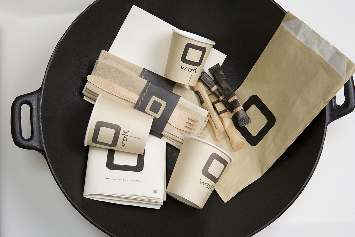
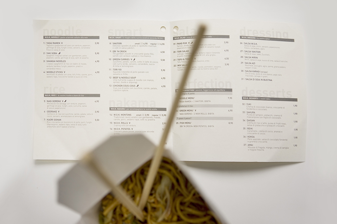
Wok | restaurant branding
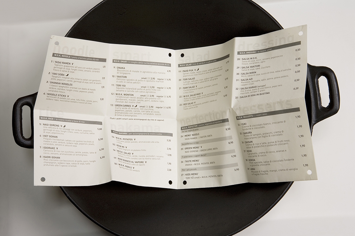
W.O.K. World Oriented Kitchen, is a chain of restaurants born from a challenge: the idea of introducing in the Italian market, at the beginning of the third millennium, the art and culture of Asian kitchen, returning its lost dignity to street food.
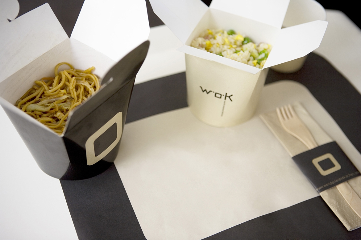
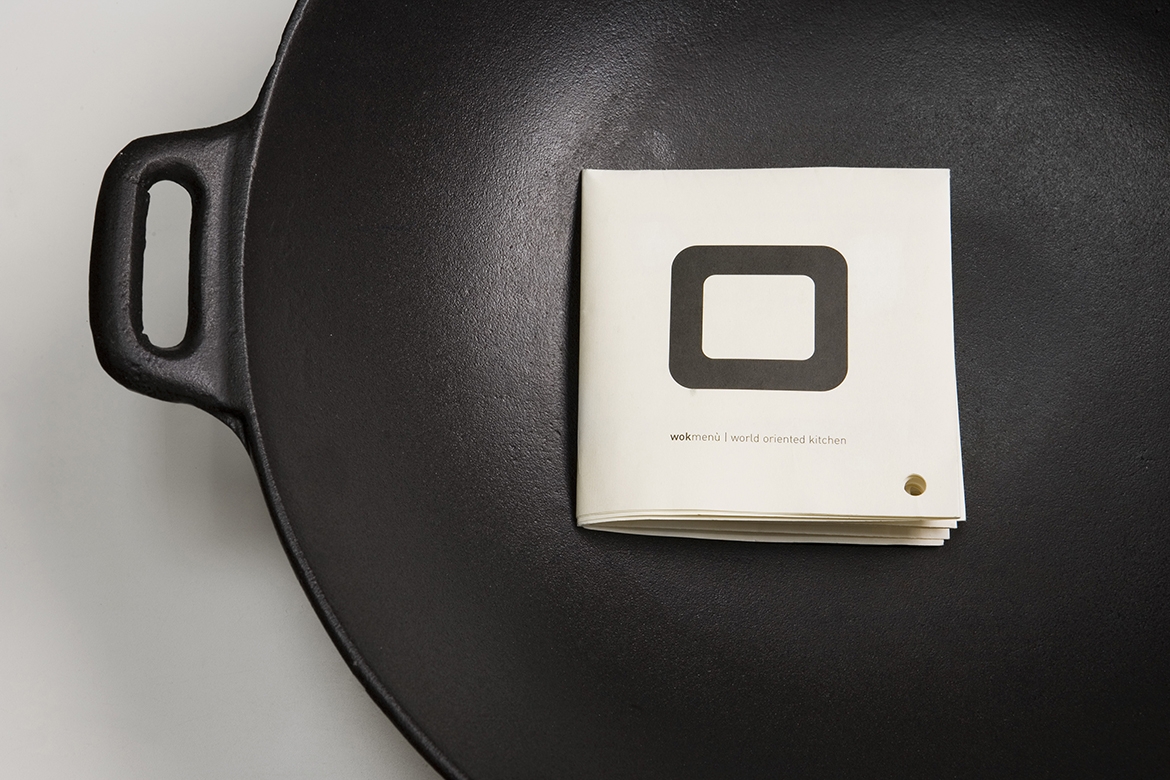
Ottodesign created a complex image structure, starting from a very essential logo that each time animates itself, gaining new nuances according to the type of material used.